Cycle Time
How long finished work actually took, door to door — the full spread of delivery time over a rolling window of sprints, not just an average, so the slow outliers that actually hurt stay visible.
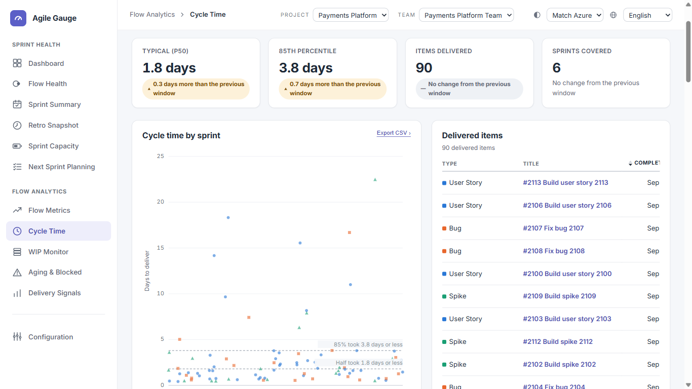
What you see
- Filter chips for three kinds of work — Planned Work, Bugs, Exploration — multi-select, with at least one always on.
- A window selector: the last 3, 6 (default), or 12 sprints.
- A confidence note next to the filters, based on how many items are in the current sample.
- A four-tile reading strip: Typical (p50), 85th percentile, Items delivered, Sprints covered — each compared against the previous window of the same length.
- A scatterplot, "Cycle time by sprint," with an "Export CSV ›" action — one dot per delivered item, when it finished and how many days it took.
- A "Delivered items" table beside it, sortable by completion date or by days.
How we calculate it
- End (completion)
- An item counts as complete only once its current state is mapped to Done under your workflow mapping. An item that isn't currently in a mapped-Done state simply doesn't appear on this chart — it isn't shown as "in progress" here, it's just not part of a chart about finished work.
- Start
- The first time the item ever moved into a state mapped as in progress. If that never happened, its Activated Date is used instead; failing that, its creation date is used and flagged as an estimate, since a creation date measures the item's age, not real working time — the true cycle time is likely shorter than shown.
- Reopened or backward-moving items
- The start stays anchored to that item's very first activation, even if it was later reopened or moved backward through the workflow — a full rework cycle is included in the measured span, not reset by the reopen.
- Cycle time value
- Fractional calendar days from start to completion — weekends included, not configurable to working days anywhere in this view. Items spanning more than about two years, or with a negative span, are dropped from the chart entirely rather than shown as a misleading outlier.
- Percentiles (P50 / P85)
- Nearest-rank, not interpolated — the value shown is always a real cycle time some actual item had, never a number in between two items. Percentile reference lines on the chart only appear once there are at least 10 delivered items in the current window; below that, a note explains why no lines are drawn.
- Confidence note
- Fewer than 15 items is a low-confidence sample, 15–29 is medium, 30 or more is high — the same bands used everywhere else in Agile Gauge.
- Duplicate items
- An item appearing in more than one sprint in the window is only counted once.
- Scatterplot
- The x-axis is the item's real completion date; the y-axis is its cycle-time days. Up to three colours distinguish Planned Work, Bugs and Exploration — capped at three because a fourth colour on a scatterplot becomes unreadable. Clicking a percentile line lists every item at or above that line.
What you can click through to
- Every dot and every table row opens that item's detail, its journey through every state it actually passed through, and a link to open it directly in Azure DevOps.
- The P50 and P85 reference lines are themselves clickable, opening the list of items at or above that day count.
- "Export CSV" downloads exactly the currently filtered and sorted table rows.
Tip
Changing the sprint window re-queries the data for that window — it isn't just narrowing an already-loaded larger set.
Known limits
- No area-path, tag, or person filter on this view.
- Only ever shows completed work — items not currently in a mapped-Done state never appear.
- Below 10 delivered items in the chosen window, no percentile reference lines are drawn.
- The previous-window comparison is blank until a team has at least twice the chosen window's worth of sprint history.